If you are building a website it’s very likely that you may have heard about responsive website design. Responsive web design is a very important aspect of creating a successful website today. The reason why responsive websites are so important to the future of Web design is that they are essential for creating a website it’s going to display properly on mobile devices.
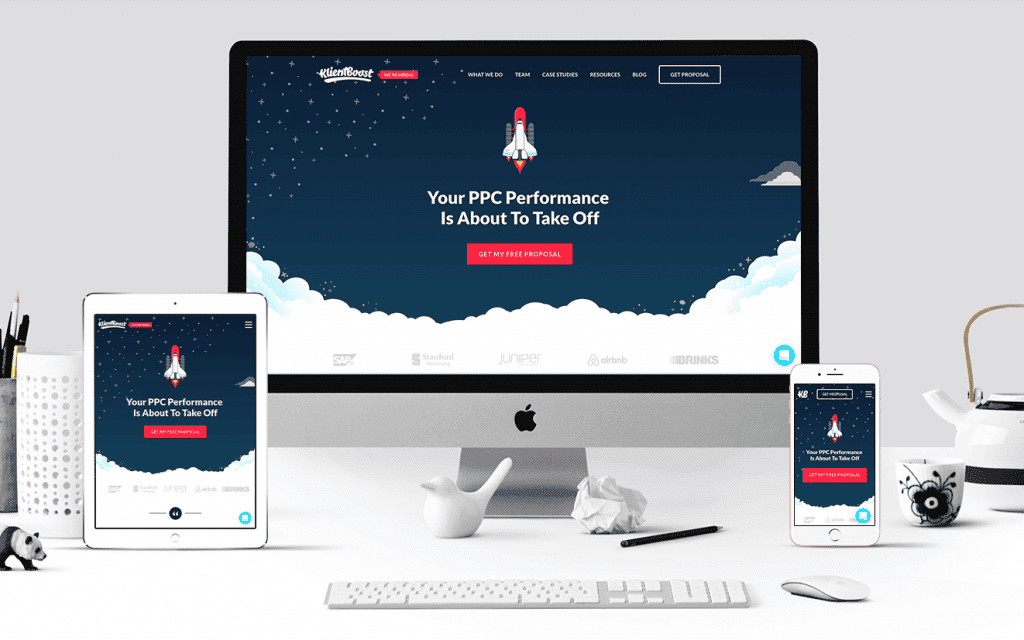
When you have a design for your website that can easily stretch across a mobile browser, you can make sure that your website is easily displaying on any device including the iPad, Iphone, netbook, Kindle and more. Any of the screen resolution issues that you might have can be instantly compatible through the responsive website design. Rather than having to struggle with a series of designs that may not display well on your device or that may get held up on a mobile browser, you can make sure that all of your mobile website designs will load in staggering quality and very quickly.
Rather than having to design a specific mobile version of a website you can have an essential design for any customer that’s trying to access your website. Making sure that every single screen resolution type for your customers can be compatible is extremely important. With the responsive website design you can make sure that every element of your page properly scales and remains functional regardless of the device that your customers are going to be using.
At the base definition, a responsive website design is a design that is developed to respond primarily to your users’ behavior and the environment that they are accessing your website. This can mean everything from the orientation, to the platform and the functionality of every button on the website. Having an intelligent layout for the website that changes based off of the device that a person is using is very important.
A responsive website design will automatically adjust to accommodate the image size, scripting abilities, resolution and more. It can also include the usage of VPN settings and more. Depending on the browser that they are using a responsive website can respond to the preferences of users for pop-ups, advertising and more. Perhaps the most compelling reason to use a responsive website is that it can also be widely effective for offering enhanced display quality even as new devices come out.
Even just a few years ago the idea of a responsive website design was considered to be a luxury. Most website designers were responsible for creating a mobile version of their website as well as the full version of the website. With the use of a responsive website design today it’s possible that every layout can be adjusted without breaking the design of a website and its full function. A responsive website design is not a complete fix without proper testing but with the design elements in place it is possible to make sure that any user could access the same functions on a website that they would get on a full-scale computer vs a small screen.
The way that a responsive website design works comes down to coding and quick scaling. Almost every single page element has a function built into it that ensures it can properly scale and load quickly when required. This includes all of the images, buttons, top bars, side bars and more. Having different resolution settings available that will change based on the screen resolution of the device a customer is on can be important. Images are often quite compressed ensuring that the content can load extremely quickly on any device as well.
A responsive website does far more than just scale the resolution of a website and some of its page elements. With proper coding included in website design it is possible to completely change the design and layout of a website so that it can scroll properly across a mobile page or function more appropriately on a touchscreen device. The changes to a website design that completely contort the look of a website when it is accessed on a specific device can make sure that anyone can enjoy the best experience on a website design. The stylesheet will adjust the colors, backgrounds, typography, widths and layout of a website to match the user preferences and the type of device a person is accessing the information on.
A responsive website design remains especially important not just for maximizing the value of a website but it can be an interface that requires consistent work. In order to maximize search engine results it’s very important for a website creator to focus in on a responsive website design. Responsive web designs are often placed above other website in search engine results because they are more accessible with mobile traffic. Having a responsive website design could be very important in making sure that your website can consistently rank higher and perform above some of your competition. Without a proper search engine ranking your site could be doomed to lose traffic and visitors.
Keep some of these top ideas in mind concerning responsive website design. Whether you are completing the first design of your website or redesigning your site, you need to make sure it follows the principles of responsive website design today.
